Maintenance
Part of Grading a forecasting cycle honestly before anyone trusts it
Forecasting case study compared with what actually happens
Forecasting rebuild on invented data: scoring what already existed, cutting a definitional break, and matching granularity to the actual decision.
This is an invented example. The company does not exist and every number below was made up to make the arithmetic visible, because the useful part is the sequence of decisions rather than the figures.
The setup: a subscription business forecasts weekly signups to plan support staffing. The forecast has been produced for two years, it is a single number, and everyone agrees it is unreliable without anyone being able to say how unreliable.
What to take away
- The first real finding was that nobody had ever computed what a repeat of last week would have given. That comparison changed the conversation more than any model did.
- Weekly data with a strong day-of-week and month-end pattern was being compared week over week, which guaranteed a confusing answer.
- The forecast improved less than the process around it did, and the process was what the business had actually been complaining about.
Week one: score what already exists
Two years of forecasts and actuals were sitting in old spreadsheets. Putting them side by side took an afternoon and produced three facts.
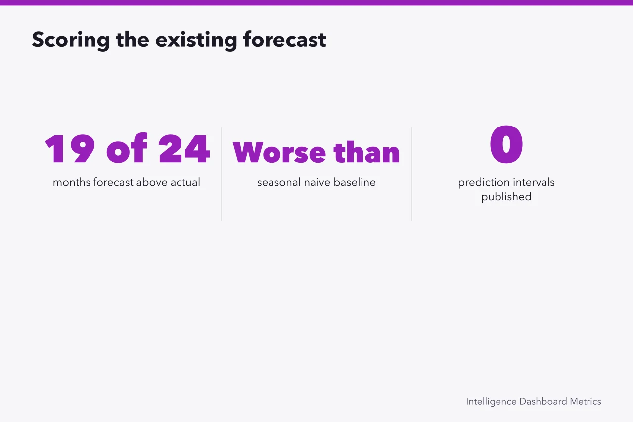
The forecast had been above the actual in nineteen of the last twenty-four months. That is not noise, and it points at incentive rather than method: a low staffing forecast is punished visibly and a high one is not.
The mean absolute error was slightly worse than a seasonal naive baseline would have produced, meaning two years of modeling had been slightly worse than repeating the same week from last year.
And there were no intervals at all, so there was nothing to check for coverage.
Week two: look at the raw series
The series was plotted, unaggregated, for the first time. Three things were visible immediately.
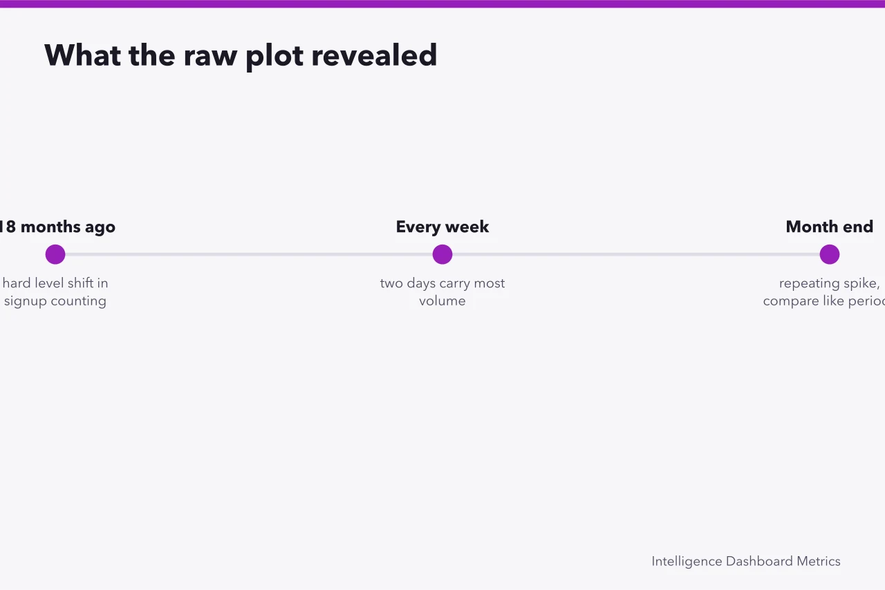
A hard level shift eighteen months earlier, corresponding to a change in how signups were counted. Every model fitted across that point was fitting a definitional change.
A strong within-week pattern, with two days carrying most of the volume. The forecast was weekly, so this did not affect the total, but it mattered enormously for staffing, which was the actual decision.
A repeating month-end spike. Comparing a five-weekend month to a four-weekend month week over week produces a movement that has nothing to do with demand. Handling this properly is what seasonal adjustment exists for, though in this case the honest first step was simply to compare like periods rather than to adjust anything.
Week three: rebuild, minimally
No new tooling. The changes were these.
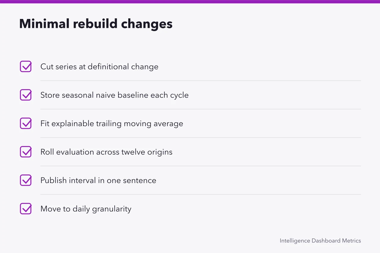
- The series was cut at the definitional change, and only the later portion used, with the earlier portion kept for context and labeled.
- A seasonal naive baseline was computed every cycle and stored beside the forecast.
- A short trailing moving average with a seasonal adjustment was fitted, chosen because it was explainable to the people who would override it.
- Evaluation was rolled across twelve separate origins rather than one holdout, so a single lucky window could not decide anything. That rolling procedure is the time series form of cross-validation.
- An interval was published, defined in one sentence on the page.
- The forecast moved to a daily granularity that rolled up to weekly, because the staffing decision was daily.
What worked
The daily granularity mattered most, and it had nothing to do with accuracy. The weekly forecast had been accurate enough for two years and useless for the decision, because staffing is decided per day.
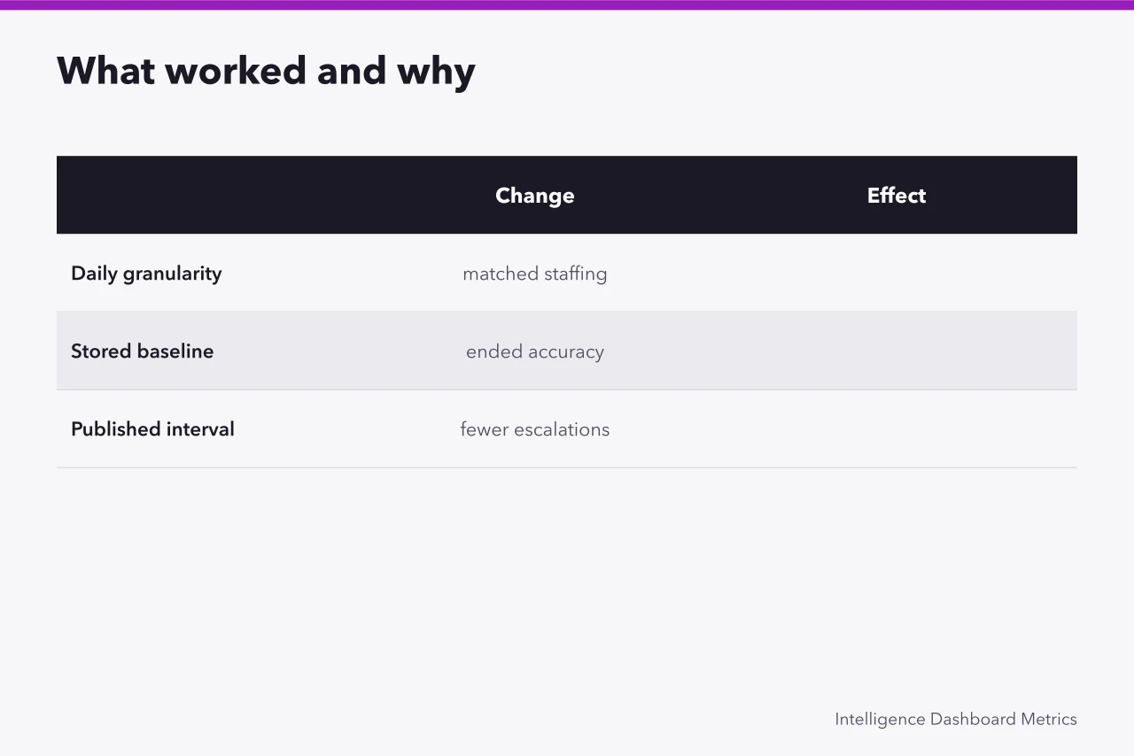
The stored baseline changed the review meeting. Arguments about whether the forecast was good stopped, because the comparison was on the page.
Publishing the interval reduced escalations. When an actual fell inside the stated range, nobody asked why the forecast was wrong, which had previously consumed an hour most months.
What failed
The bias did not go away. Nineteen months of over-forecasting was an incentive problem, and a better model does not touch an incentive problem. It only became visible when the signed error was reported with its run length, and it took a change to how staffing variance was reviewed before the pattern broke.
The definitional cut was contested for months. Cutting eighteen months of history made year-over-year comparison impossible for a while, and several people wanted the old series stitched back on. Refusing that was correct and unpopular.
The interval was initially far too narrow, because it was computed from residuals on a period that happened to be calm. Coverage over the following two quarters ran well below the stated level, and the interval had to be widened, which looked like an admission of failure and was in fact the system working.
What generalizes
Score the existing forecast before improving it. Plot the raw series before modeling it. Match the granularity to the decision rather than to the request. Store the baseline. Expect the incentive problem to survive every technical fix.
None of that requires a method anyone would call sophisticated, and all of it can be done in three weeks by one person with a spreadsheet.
Related reading on this site
Forecast methods and review are in how forecasts are built and reviewed. The pre-publication sequence is in twelve checks before a forecast goes out.
Scoring choices are in choosing a forecast error measure. The register and review cycle are in a forecast register and a review cycle. The habit of reading a written-up result skeptically is in how to read a platform case study.
Common questions
Three weeks seems fast. Is that realistic?
The analysis is fast. Getting agreement to cut the history and to change the granularity took longer than everything else combined, and that is the part to plan for.
Why not fit something more sophisticated?
Because the people who override the forecast have to understand it, and an override applied to a model nobody can explain is applied without limit. Explainability was worth more here than a small accuracy gain.
Should the old two years have been thrown away?
Not thrown away, but not used for fitting either. A definitional change means the earlier series measures something else, and stitching the two together produces a trend that is an artifact of the definition.
How would we know if our own interval is too narrow?
Count. Over a couple of dozen periods, check how often the actual fell inside the stated range. If a stated eighty percent interval is containing the actual half the time, the interval is wrong regardless of how good the point forecast looks.